
Overwatch 2 Redesign
Objective
The main objectives were to 1) create cohesion between user behavior and game development goals, 2) plan and conduct usability tests to gather user feedback on the updated interfaces, and 3) develop and iterate interfaces that will improve the UX for a diverse population with different needs.
Duration
7 weeks
Tools
Figma, FigJam, Photoshop
Context
The project was my first experience with UX/UI, Figma, and FigJam, so every step of the process was new and exciting for me. We were to choose a well known video game and make UX and UI changes after conducting research on users.
My Role
UX/UI Design, Testing
The Team
Solo
User Research
Identifying pain points in player experiences
To fully understand the experiences players have in Overwatch 2, I first watched several playthroughs online to get a good grasp of the flow of the screens and the user interface. Following this, I more closely analyzed the players emotions through a player journey map, paper prototype, and user flow chart.
Player Journey Map
The intial step to this research process was to brainstorm and breakdown the flow of actions and screens the player will see. In the player journey, each screen is scrutinized to describe what the player sees, what they hear, how they feel, as well as the actions they can take, such as choosing a game mode or selecting a character.

Paper Prototype and User Flow
Next, after the player journey, I starting putting pen to paper to combine the game goals and intentions with the player’s journey. This will help illuminate what screens are necessary, along with what options are needed to allow the player to smoothly move through the gaming experience.

The paper prototype can then quickly be put into a flow chart format for ease of viewing and understanding all the actions that can occur between screens.

Usability Testing and Wireframe Mockups
Initial Wireframe Mockups
The intial wireframes can then be created using stock images, fonts that are available, and any variety of colors and shapes in Figma Design files or any other software. I start by re-creating the home and in-game screens in order to conduct usability tests and iterate on these wireframes.

The mockup above is my reconstruction the home screen of Overwatch 2. All interactable buttons are highlighted orange for clarity on clickable UI elements. Since it was just a quick mockup, the fonts, icons, and images are just rough placeholders.

The wireframe above is the reconstruction of the in-game screen. I blurred the background image to draw more attention to the UI elements on screen. Similarly, all orange items are interactable for the player and can be adjusted in settings.
Usability Testing
Following the re-creation of the home screen and in-game wireframes, I conducted three usabilty tests to pinpoint what tasks and user flows needed to be redesigned.
My Research Objectives
Evaluate static wireframes with players to understand potential miscommunication.
Are players able to easily/smoothly understand all the options on the Overwatch 2 home and in-game screens without assistance? If not, why?
Can players quickly start playing the game from the Home screen?
Are in-game UI aspects intuitive?
How do players feel about the design on both screens?
Iterate both wireframe designs based on the usability test feedback from all testers.
My Research Logistics
Recruiting testers:
Three unique testers
Target users: 16-30 years old
Platform:
Static wireframes made in Figma Design file
Task Design:
Short action-based tasks. Record notes on how each user reacts
Schedules:
Date/Time: Sept. 9-10th, each around 15-20 minutes
Research Notes
With a clear direction and goal in mind for my research, I then conducted my three usability tests and recorded notes and main points from each interview. The following chart is the summary from each tester.

Usability Test Results and Actionable Items
Seemed like the add/invite friend option had the most issues in terms of ease of use and placement
The rest of the options seemed to be easy to digest, especially the placement of the menu/settings optionIn game screen options seemed to also make sense especially with overlay of the abilities on the character’s weapon and the electricity to show that the center ability ‘Q’ is the ultimate ability
Need to ‘redo’ the invite friend to make it super clear on the screen, but keep that icon in the top right to be more of a ‘see friends’ button. This might clash with the ‘social’ button, but I still think they can have differences
Will try adding a minimap to the In game screen to show the map layout and health pack locations.
Will also add some additional key binds to the In game screen to help players view the objectives and view their character details
UI Moodboard and Inspiration
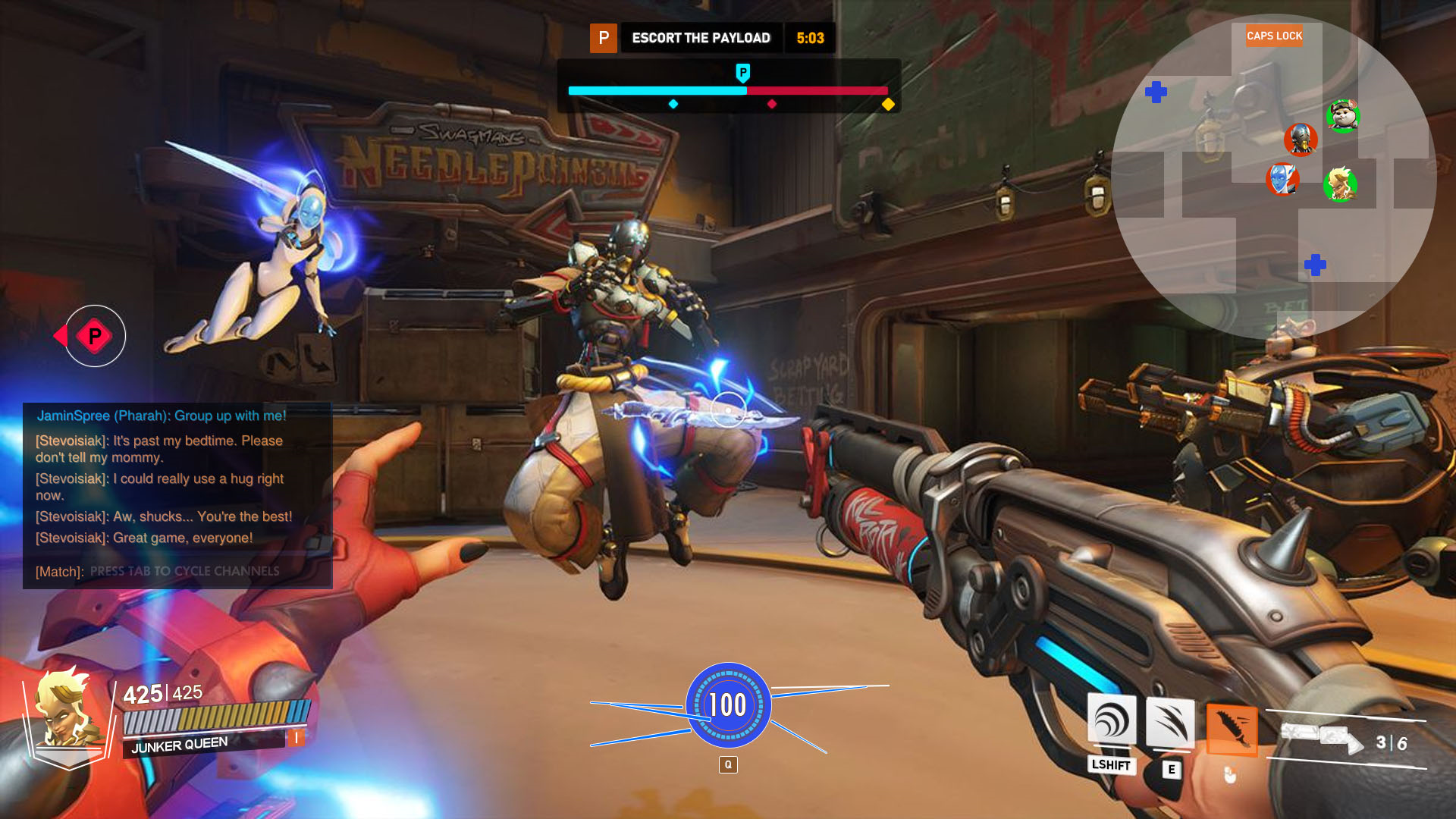
With all the data I gathered, the next step was to find inspiration and design solutions for the pain points I found. Some prominent games I drew inspiration from included Valorant and Apex Legends.
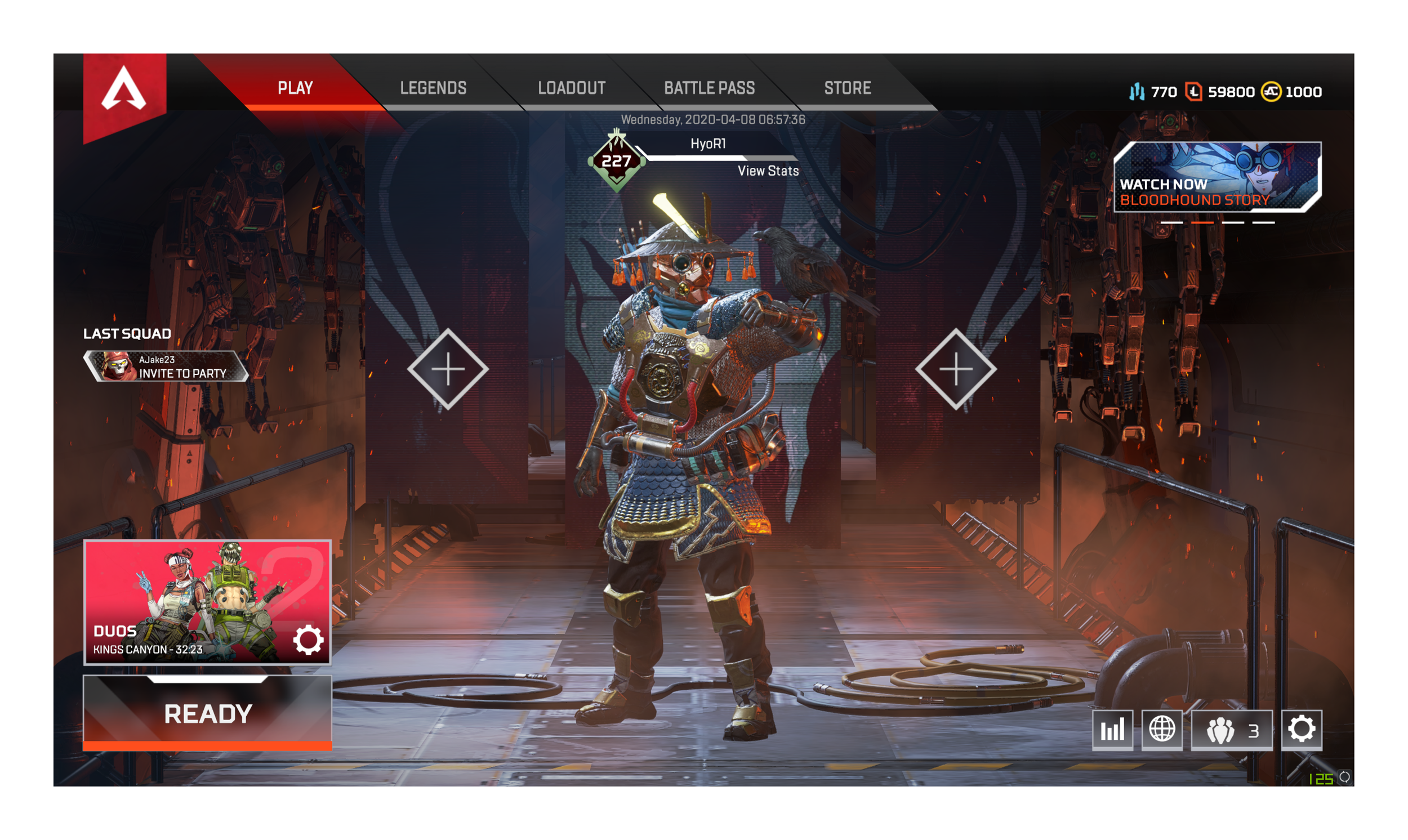

As seen in the left image (Apex Legends), the buttons to invite friends are very clear. I felt that this design was very easy to understand for players of all levels and wanted to incorporate it in my iterated frames. Similarly, the image on the right shows the minimap function in Valorant. This allows players to see where they are in the game at all times, and I felt that for Overwatch 2, this would be useful especially for newer players.
Iterating Wireframes
First Iteration Wireframes
Using the moodboard inspiration and data from the usability tests, I then iterated on my initial black, white, and orange wireframes to address major pain points.

The mockup above is my iterated home screen. As seen, there are four new orange buttons added to make inviting friends easier, following the user test feedback. Further, each friend added on the home screen will also have their gamer tag showing under their character. I added a character image for each person in the party to enhance the feeling of playing with a group of people.

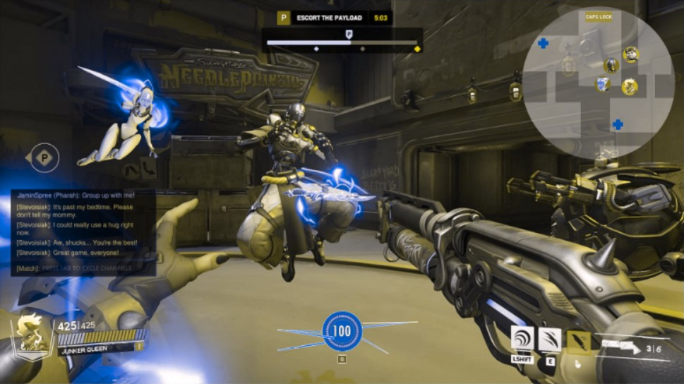
Above is the iterated in-game screen. This wireframe now has a minimap showing teammates and healthpacks, additional buttons to view Hero information [I], and buttons to view what the objective is and how to achieve it [P].
Second Iteration Wireframes
I then polished up the grey scale wireframes into high fidelity wireframes to demonstrate how it would look if it was live in Overwatch 2. This includes matching all fonts and adding full color images and icons to each wireframe.

As seen with the updated home screen above, the background has been updated to draw attention to the character, and the four ‘invite friends’ buttons have been polished to match the rest of the UI.

In the in-game screen mockup, I have included a rough minimap in the top right corner to show healthpacks (blue plus-signs on the minimap) and all Heroes (enemy and ally alike) in sight. It would be a settings function to determine the size for the minimap.
Accessibility Testing
It is always important to test games for accessibility to people with needs. In this case study, colorblindness is the object of testing, so I put the mockups through three different colorblindness filters to see what issues would arise.
Blue Cone Monochromacy

In these blue cone monochromacy filter frames, everything seems a little duller and only the words and abilities stand out on the screens. The only colors that are more clearly visible are reds and very pale blues, but even then, they are very muted; it is difficult to see any health packs, or enemies and allies on the minimap.
Tritanopia (Blue-blind)


Protanopia (Red-blind)

In these blue-blind filtered wireframes, the characters seems to blend into the background, and only the words really pop out. It is apparent that all blue colors pop as a teal shade, and reds show up very brightly. Thus, the enemy icons on the minimap pop out well but allies are dulled, and health packs are bright but difficult to see easily.


In these red-blind filtered frames, the character’s color scheme also blend into the background. Blue shades show up very well, but reds and oranges are all a muted yellow color. Thus, on the minimap, everything is very muted and grey scale, making these frames inaccessible.
Final Iterations and Accessibility Testing
Updated Home Screen Wireframe
After studying the three colorblindness variations, I updated the home screen wireframe to have a darker background. This way the words and character will contrast more to catch the player’s eye. Running this new mockup through the same colorblindness filters shows that in all three instances, the words and character show up better and would also be more accessible to colorblind players. Of course, some additional color and contrast changes can always be made depending on other colorblindness conditions to improve playability.


Blue Cone Monochromacy


Blue Cone Monochromacy

Tritanopia (Blue-blind)

Updated In-Game Screen Wireframe
Similarly for the in-game screen, I decided to make the ultimate ability a solid, bold, blue color (I have since learned that the ultimate is indeed fully blue in Overwatch 2, so it is nice to know I was on the right track of thinking) as well as update the healthpacks in the minimap to be a darker blue. This way, the fully charged ultimate ability is very easy to see in all three colorblind instances, and the healthpacks are also more visible on the minimap.
Tritanopia (Blue-blind)
Protanopia (Red-blind)
Protanopia (Red-blind)
Minimap Adjustment
In order to save UI real estate on the screen, I assigned the minimap to be collapsible as it was taking up a large portion of the screen. This way, by pressing the Caps Lock button on the keyboard, the player can toggle the minimap on and off.
Final Thoughts and Conclusions
Key Takeaways
Setting up neutral, non-leading usability tests to gather objective information and feedback can take some iterations to perfect. However, it is very important to have objective questions in order to improve your UX/UI designs for the best outcome for players. And the more user tests you conduct, the more actionable feedback you’ll have to improve your wireframes and mockups.
Making sure that you really put yourself in the player’s shoes to test each screen and each button. This will ensure that you account for all possible player behaviors. Sometimes it helps to pull inspiration from other game UX/UI.
There are many different ways to help make games more accessible to all players, and keeping an open mind to these cases will allow you to create more diverse and easily digestible UI down the line.
Future Actions
Adjust more of the color schemes and contrast for even higher accessibility. Some of the controls (such as the Caps Lock indicator) need to be a different color to stand out more in color blind settings.
Continue to experiment with the minimap function, perhaps more usability testing, to find a smarter solution.
Experiment with the crosshair colors/shapes/indicators to find a smarter solution.