HomeHustle
Where convenience meets innovation, making your next move easier than ever.


Objective
My objective was to design an app that assisted people with choosing their next home, whether that’s an apartment or house. Through extensive research, my team and I found the pain points and needs of our user base and designed a solution with these in mind.
Duration
3 weeks. Agile/scrum methodology
Tools
Figma, FigJam
Context
HomeHustle is a home touring and furniture placement app that allows users to quickly make their next housing choices without the need for time-consuming in-person tours. This app uses AI to maximize efficiency in viewing and laying out furniture in the moving process.
My Role
UX/UI Design, Testing
The Team
Worked with 3 other UX/UI designers
House Hunting Challenge
The headache of moving and reorganizing furniture into a new space is, unfortunately, something familiar with all of us. From searching through endless options available online, to filtering through appealing options, to touring and visualizing furniture in a new home, these steps in the process are tedious and time consuming.
User Research
Identifying pain points in user home search and moving processes
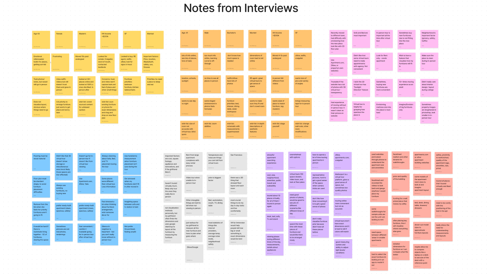
To accurately understand and empathize with current home seekers, it was crucial to conduct user interviews. Thus my team conducted 7 user interviews to learn about their behaviors, thought proccesses, motivations, and emotions. We took a heavily open-ended approach to ensure our questions were unbiased and to gain a clear and strong understanding from each interviewee.
Main objectives
What steps to users usually take when planning to move?
What factors most strongly determine a users moving decisions? Why?
What are current pain points users have while looking and planning their moves?
Key takeaways from interviews
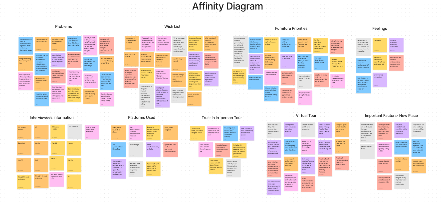
We utilitized affinity diagrams to gather and organize the data collected from all of the user interviews. We grouped and identified insight categories according to their common threads. Through this, we were able to synthesize our key takeaways about the pain points and typical experience users have with looking for new homes:
Large time commitments to tour places in person
Distrust in photos and images seen online for various homes
Difficulty finding accurate floorplans
Inability to visualize living in the space with existing furniture
Following the synthesis of these key research points, we developed a user persona. This would then help frame all the issues our users are having and allow us to develop solutions with a specific user in mind.

Solution Ideation
Honing in on specific features
With a user persona and key pain points laid out, we could then turn our focus on strategizing solutions for these issues. After discussing several solutions, we needed to hone in on several priority features.
User insight statement
Busy people seeking relocation need to quickly, conveniently and deliberately determine if a new place is a good fit for their lifestyle because many intangible conditions, such as dimensions, lighting, and aesthetic details of the homes, are typically not captured accurately in listing photos or 3D tours.
Feature prioritization
My team and I then generated many ideas to solve our user’s problems. We then moved these ideas onto a matrix to determine their impact and feasibility - those that fell into the high impact and low complexity were ideal solutions to work with, but we wanted to challenge ourselves to tackle some of the high impact and high complexity ideas.
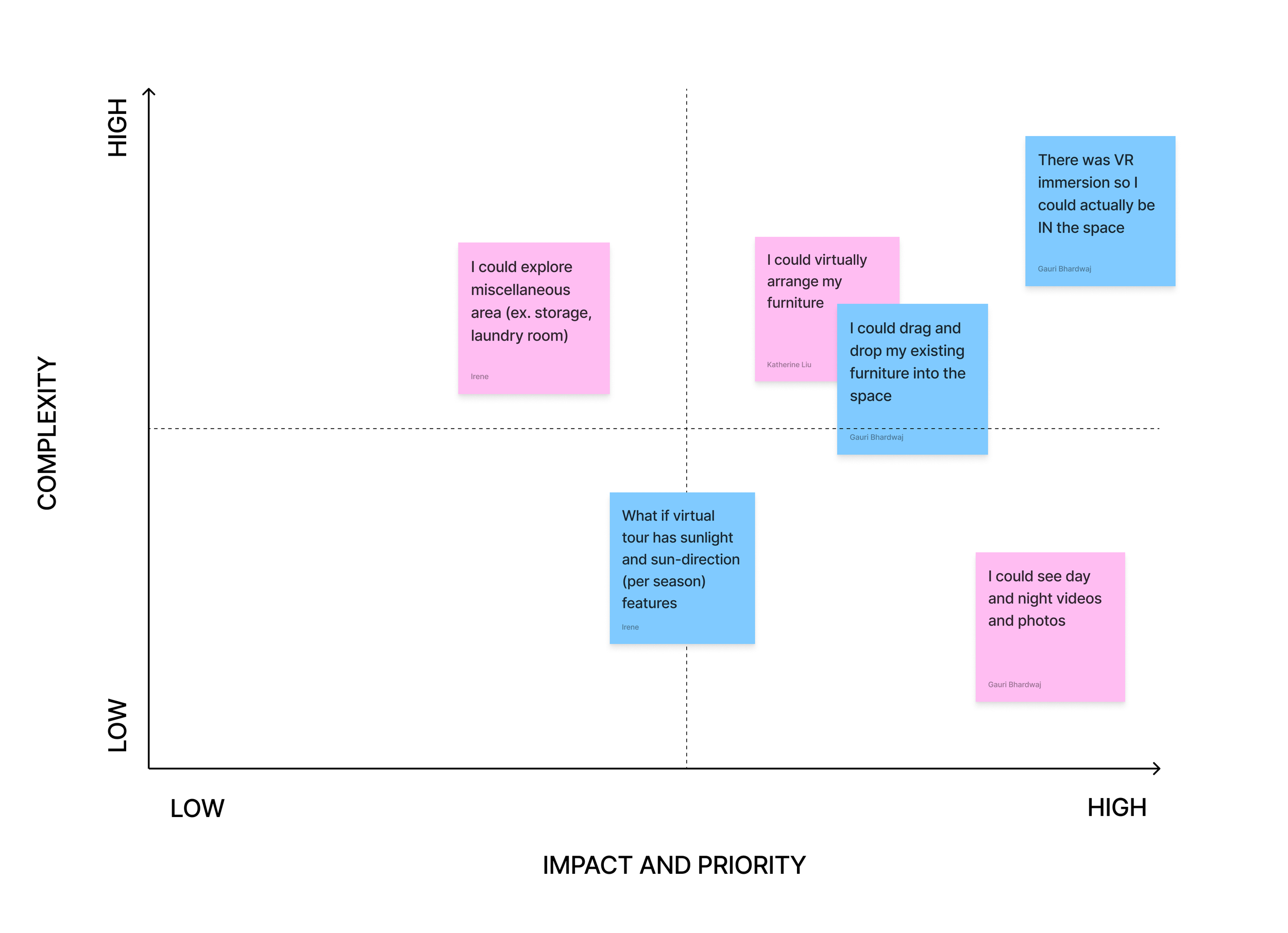
Breakdown of priority features
Ability to simulate VR immersion and walk through the floor plan spaces
Ability to virtually arrange furniture into the different spaces
Ability to view the space at different times of the day
These features would significantly improve our user’s quality of life in choosing their next homes.
Market Research
Identifying key competitors
As with any new company, it is necessary to thoroughly research both direct and indirect competitors. We identified 4 competitors that potentially already meet the primary goals of our app.
Direct Competitors:
Matterport
Houzz Pro
Indirect Competitors:
Zillow
Apartments.com
Our competitive advantage
Our app stands out as it incorporates VR/AR to allow users to virtually place and arrange furniture in different floor plans
We also allow users to view different homes at different times of the day to see how lighting changes
User journey
Building off the foundation of clear solutions and a good sense of the market, we then moved towards defining the user’s journey. This step allows us to imagine the process and emotions of users trying to find their next home, which would allow us to find other major pain points and gaps.

User Flow & Initial Sketches
Identifying the home searching experience
Following the story above, we then laid out the task flow our users would experience using our app.
Initial sketches of the app
Now that we had a very clear idea of how the user would walk through the app, we began sketching rough ideas of each screen.

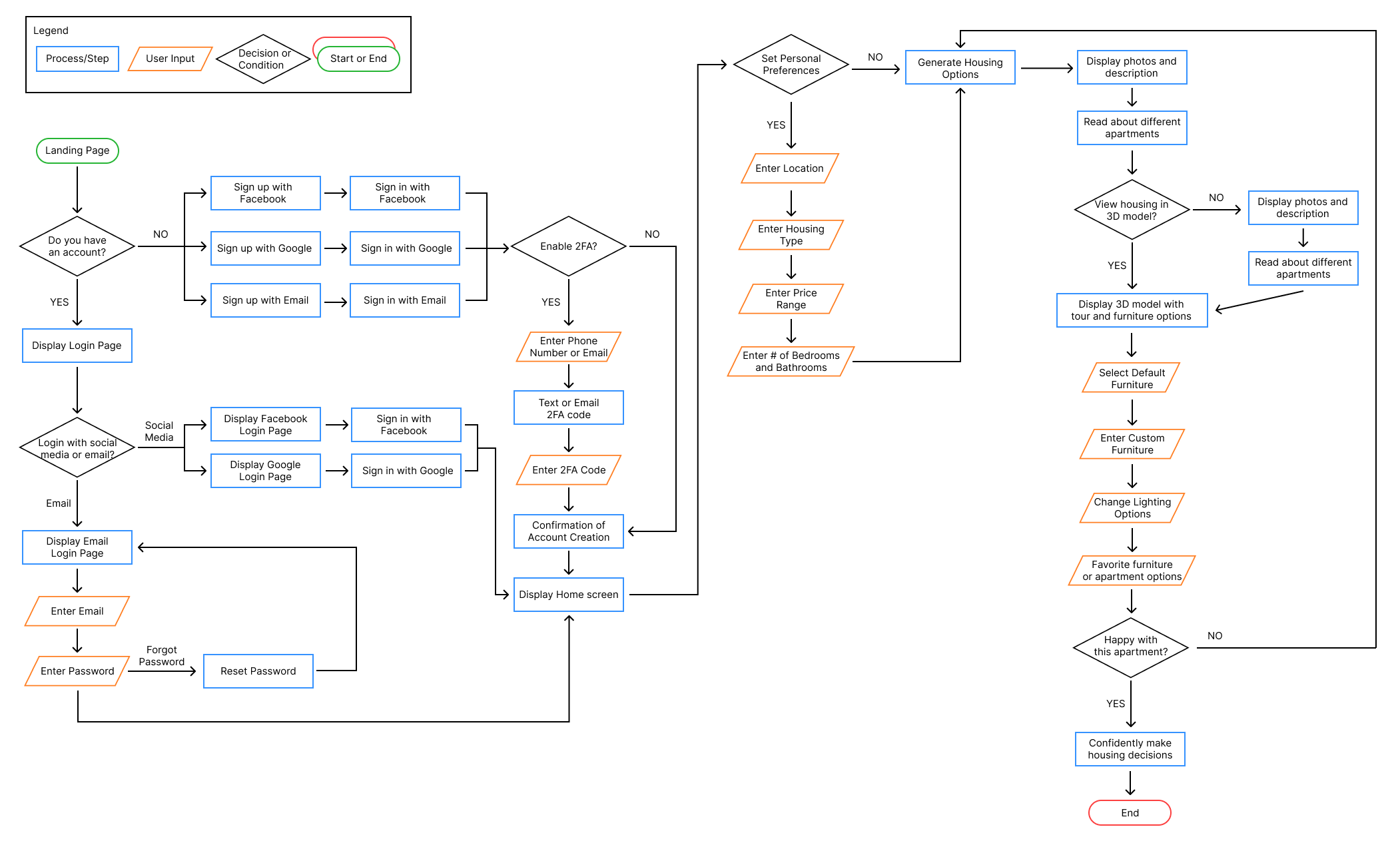
Wireframes, Prototypes & Iterations
Developing wireframes and prototypes
Starting with our low fidelity wireframes, we used them to set the stage while allowing for very flexible changes. We conducted usability tests at every stage of our wireframes and iterated upon the feedback to improve upon our designs. Further, we had A/B testing for the high fidelity color scheme and layouts.


From lo-fi to mid-fi, we added a default furniture option to allow users to test with standard furniture to save time.
Further, we added a navigation bar and heading icons.

From mid-fi to hi-fi, included the ability for users to place furniture within the floorplan and move them around. We also updated the furniture options to include images for faster selection.

Furniture arrangement frames
Lo-Fi
Apartment listing frames
Mid-Fi

The lo-fi apartment listing frame was very simple, but in the mid-fi frame, we added the map and ability to search and like different listings.
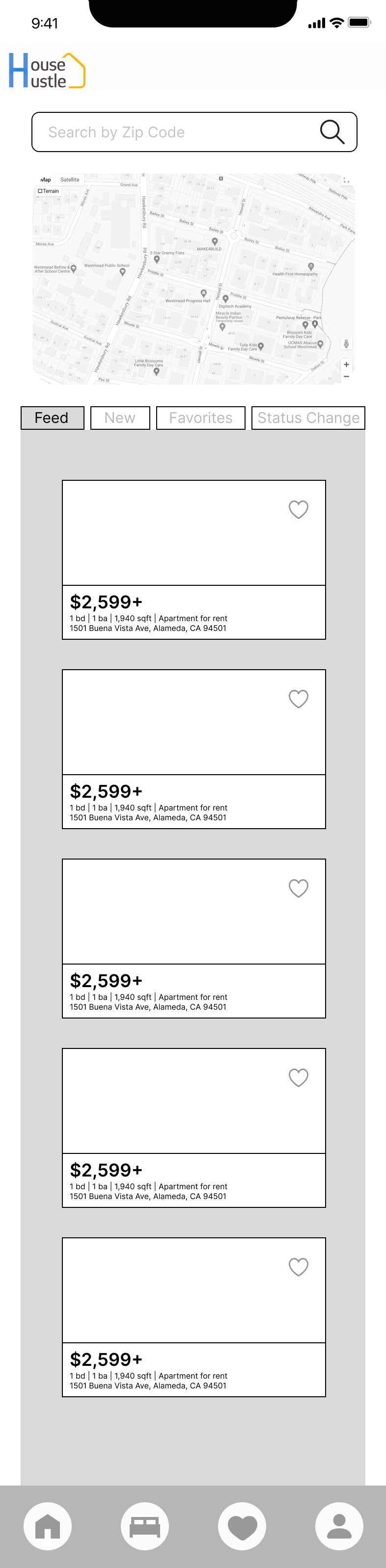
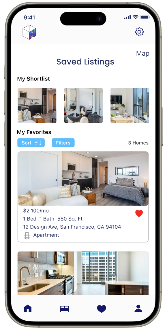
The hi-fi frame shows a polished version of the mid-fi, with a simpler list view and listings showing on the map.

Lo-Fi
Mid-Fi
Hi-Fi
Hi-Fi
Results and Thoughts
By the final round of testing, our users were able to smoothly navigate through the app and complete tasks. We were able to successfully address many of user pain points such as quickly viewing furniture arrangements, and toggling the time of day to see lighting changes. Although the prototype is the minimum viable product, this home search app would greatly streamline home searching users’ experiences.


Next Steps

Add property owner portal and technology partners
The original idea was to make HomeHustle a platform that would allow property owners to also quickly list their properties. This app would help reduce the time it takes for properties to be acquired by renters or homeowners, thereby boosting profits and transactions over time. Further, we would want to push this app to partner with other existing companies such as Wayfair, IKEA, and others to streamline furniture additions, and companies like echo3D to streamline virtual movement.
Ability to walkthrough the app as if in VR
We wish to improve the 3D touring experience by allowing the user to fully control their movements forwards and sideways as if they were walking through a video game space.
Enhanced AI assistance
Improve the capabilities of AI in this app to have it suggest complete furniture layouts, alternative layouts, and the ability to save previously created layouts and make adjustments to them.
More features
Some additional features to work on include being able to more precisely show the lighting in the home depending on the time of day, the direction of the sun, and any obstructions outside of windows for a more accurate representation.
My Own Takeaways from this Project
While this project allowed me to hone my UX/UI skills, it also gave me the opportunity to explore an area I am deeply interested in (VR/AR) through wireframes and prototyping. This was something I had not attempted prior to this project and pushed me to try new things in Figma. I thoroughly enjoyed conducting the user interviews and usability tests to gain a better understanding of pain points, especially those that I had not personally experienced. There is plenty of room for improvement, but the feedback we received from our peers and instructors was overwhelmingly positive. I am incredibly proud of myself and my team on the app we developed, and will continue to grow and learn more from this and future projects.